かいぶつの森
(Vist the Beast Forest on netlify and see the code on Github).
I, like many people who have been stuck at home lately, have been playing Animal Crossing: New Horizons. Aside from the gameplay, I was struck by the uniqueness of user interface elements.
To me, Animal Crossing has a unique design in terms of User Interface. But most of the things that seem novel to a westerner are pretty much just normal Japanese graphic design.
Here’s a random sampling of some Japanese web graphics that I think represent the type of design I’m thinking that look somewhat like Animal Crossing.
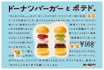
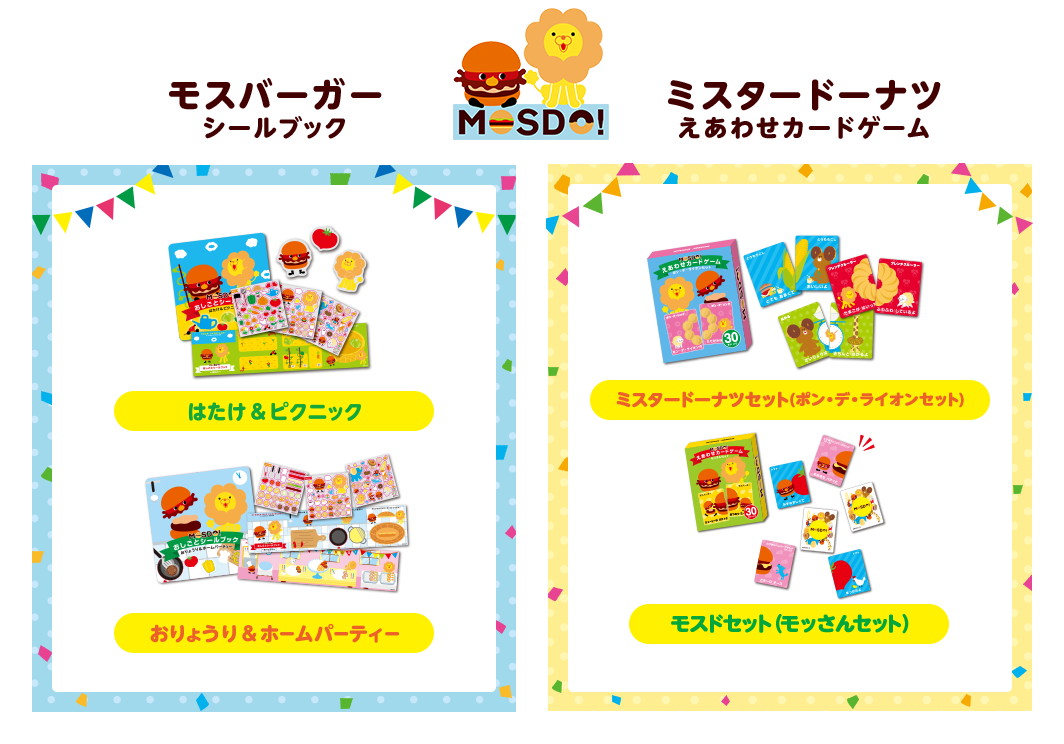
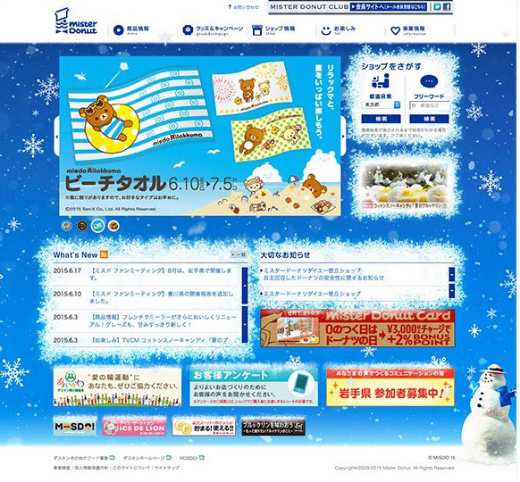
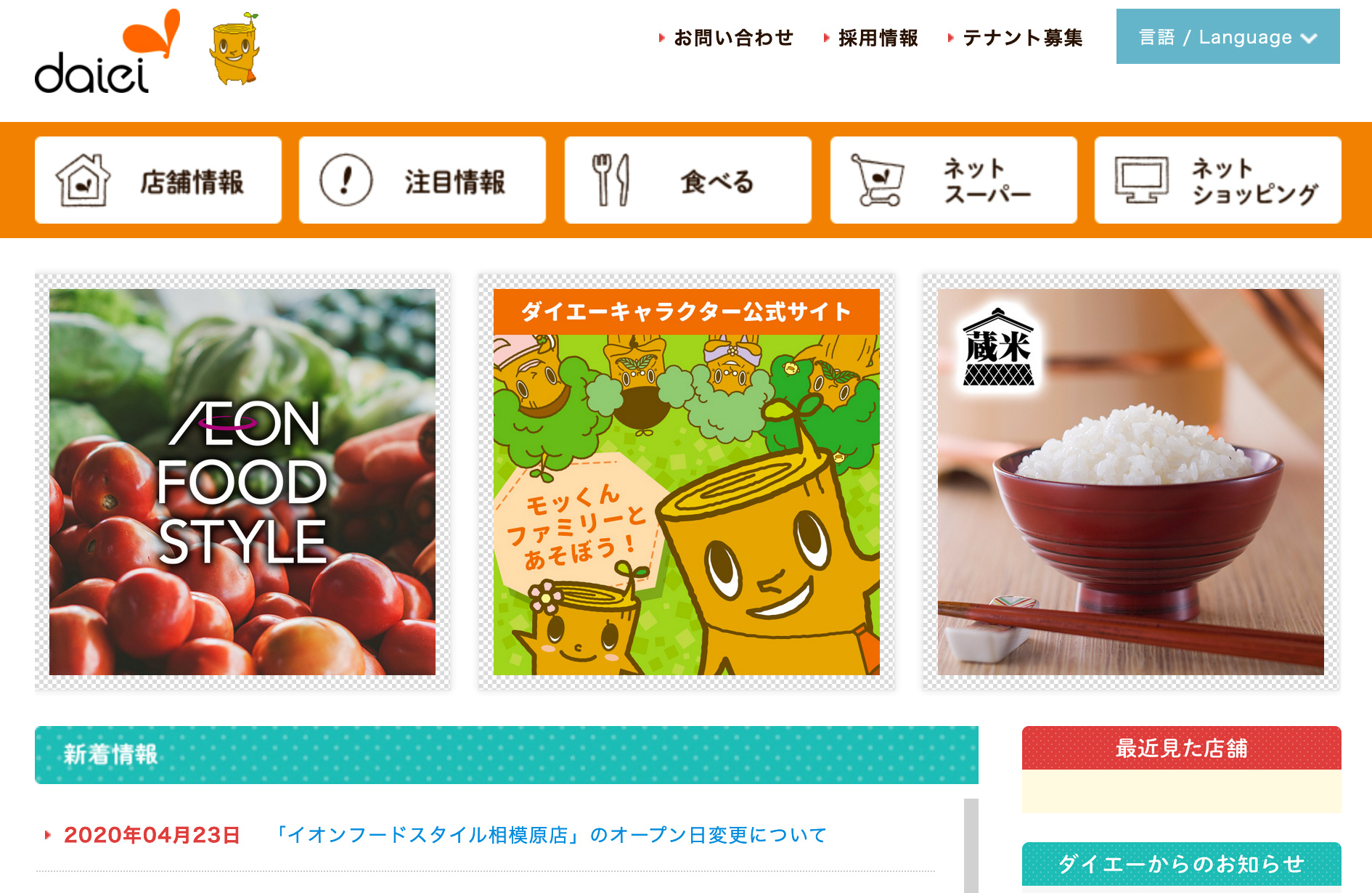




“Tom Nook” is almost certainly a Tanuki - a type of racoon we don’t really have in America. To someone unfamiliar with Japanese folklore, (or simply someone who hasn’t played Super Mario 3), this particular reference may fly right over your head.
To me, Animal Crossing seems much less “westernized” than your average game that comes to America from Japan.1 It’s hard to deny, especially when compared to something like Mario or the Zelda games, that Animal Crossing is Nintendo’s most Japanese game. Although I suspect some of the scenery in this picture is stuff that’s only in the Japanese release, just look at this.
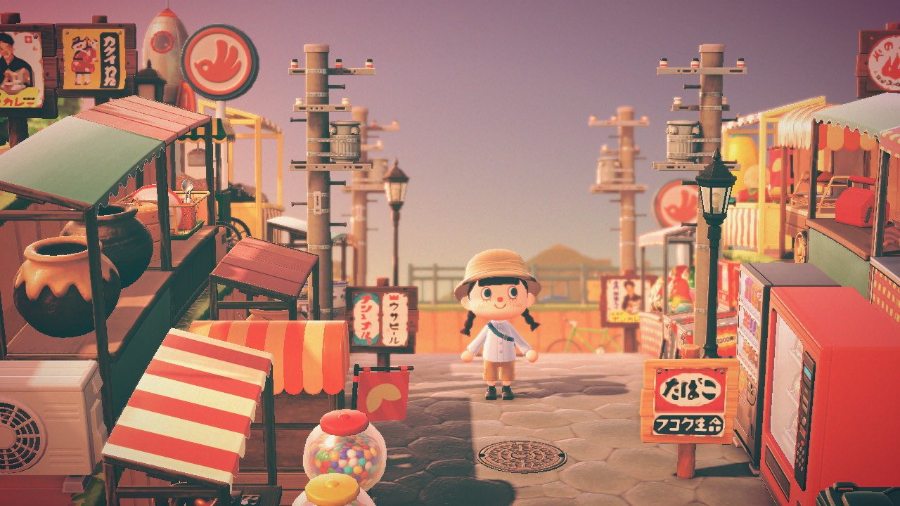
Even a someone who has only spent a small portion of my life there, this just Looks Like Japan.
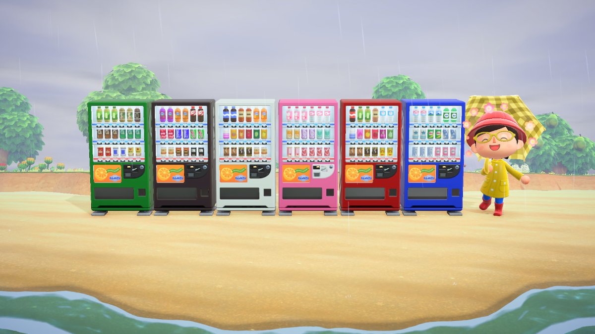
And, also, this type of vending machine is absolutely Japanese.
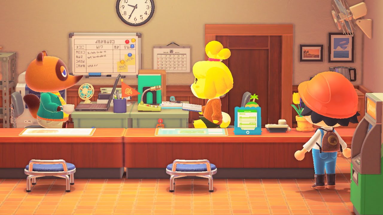
When Tom Nook’s office is upgraded, the way the desks are arranged was exactly like the student’s office when I was at school in Japan. I don’t know if this is actually common in Japan, but it really struck me as strange.
So, not to diminish it in any way, but I suspect many of the things that we like about Animal Crossing are, more so than other Japanese videos games, a reflection of Japanese culture.
So I really wanted to start making an Animal Crossing UI kit. What I ended up with was a “Caption Maker”.
Exploring the Beast Forest
I focused on two main aspects.
Fonts
One of the things I really wanted to get right was the fonts. At first glance, the main font looks a lot like VAG Rounded or Arial Rounded, but it’s not. It’s definitely a Japanese font. The letter shapes just aren’t quite right.
After some internet sleuthing, I discovered that it is Seurat, from Fontworks. The dialog font is another one from Fontworks, this time it’s Rodin Extra Bold.
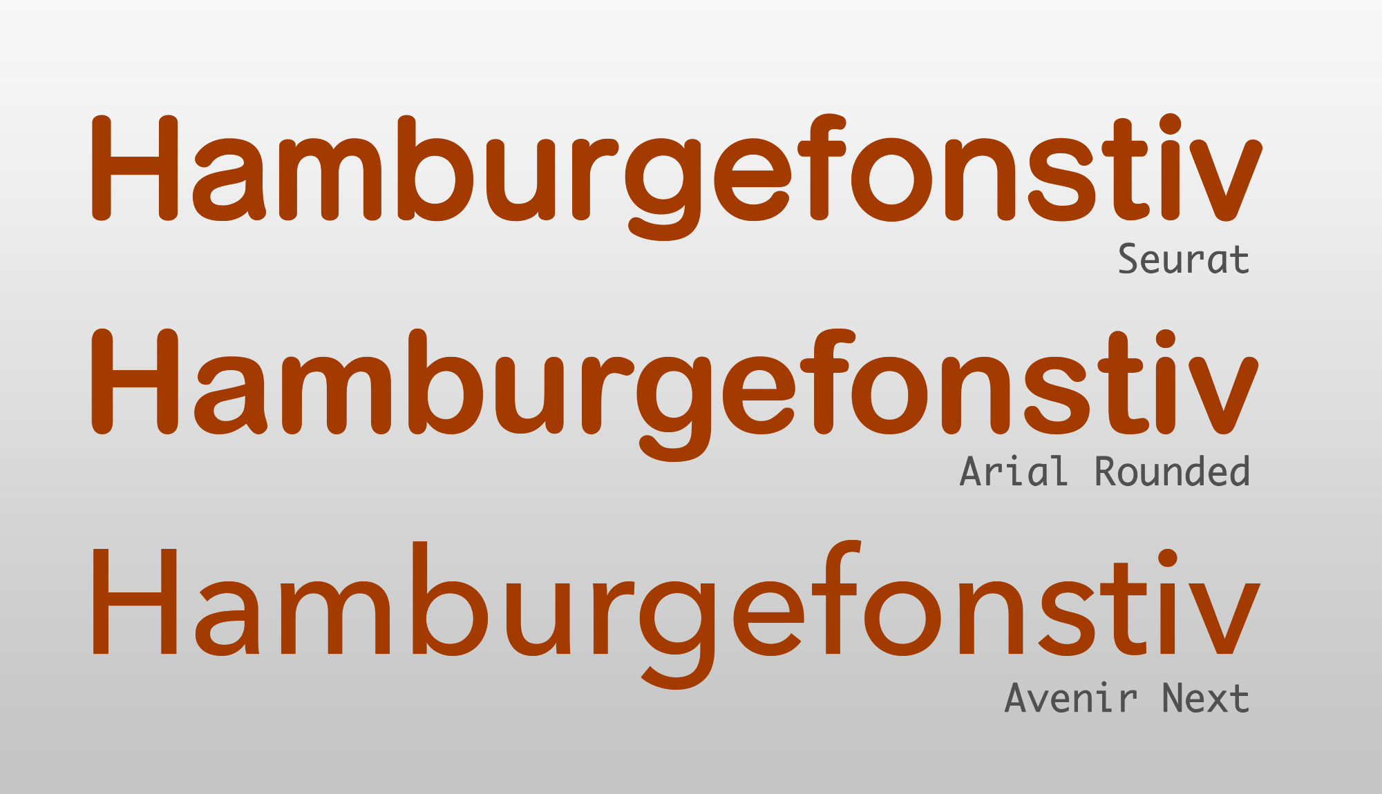
The stroke width is almost completely the same, there’s very little contrast in stroke width. The horizontal stroke is thinner than the vertical, but not as much as Arial Rounded or Avenir. The x-height is much higher.
Again, this is not bad, I actually really really like this font, and I think this is to be expected from a font where Roman characters aren’t the main deal.
The rounded corners
Ever since iOS 7, I’ve begun to notice whenever a Rounded Corner is not the fancy new version. I really noticed this in ACNH. It’s always kind of bothered me that this type of thing was really hard to do with HTML/CSS, so I set about trying to make something that would work about as well as border-radius does.
This was quite difficult. at first I tried using SVG clip paths, which mostly worked, but when the content of the box was larger than intended, you get distortion.
Then I found this article, which looked promising. However, I was having trouble getting it to work as a clipping path. I really wanted it to be implemented as a clipping path so you could have whatever kind of background you want, instead of just having an SVG.
I tried quite a few different things. At one point, I had three different SVG masks - one fat, one “average”, and one skinny, that I would apply to the divs dynamically with JS by testing the aspect ratio of the content. (Apparently container queries still aren’t a thing).
But what I ended up with was basically just manually creating new SVGs in Javascript for every box and applying that as a mask, and then updating when the window resizes. This way, the curvature of the sides could always stay the same but the height and width of the div could be adjusted.
It’s a little bit complicated for such a small thing, but I really like the way it looks. For this project, I implemented it as a Vue.js component, but the technique could be done in plain JS. Hopefully I can use this on another project.
For the speech box, I couldn’t really find a convincing way to make this where it would stretch to fill content, so it really just looks best when it stays pretty much the same size. In the game, the content scrolls within the bubble anyway, so this isn’t as important.
Some other elements, such as the “bean” shape that is behind the speaker’s name, I just implemented as a standard SVG mask. It becomes distorted looking if the name is too long, but that doesn’t worry me too much. I’d rather do that than have to write more Javascript to create more SVGs. It was not fun, nor easy.
So, at this point, I had pretty much achieved what I wanted to. But I hadn’t really made anything that I thought would be much utility to anybody else. My goal was to create something that looks as close to the original animal crossing interface as possible, I thought it could be fun to let people make their captions, and “pretend” that, say, Tom Nook is yelling at them or something. So here it is. Check out Beast Forest - Caption Maker.
Some of the things I experimented with during the course of this project:
- CSS Grids: A++++ would grid again.
- SVG Masks: hard to do in a non-fixed-width way. C+.
- CSS Clipping Paths: Things are much better than the last time I investigated this, but still not as robust as I would like. B-.
- Deleting character ranges to delete from a Japanese font so the font isn’t 5+ mb: A- (annoying, but useful to know)
- Animating individual letters in a word: B+ (hat tip to Robin Rendle at CSS-Tricks) How to Animate Text with SVG and CSS
- Styling file inputs: A- (this used to be basically impossible, now it’s pretty good!)
- Creating an image from HTML with JS: B+ (I’ve dealt with this before, but this time around I used Dom-to-Image and it worked out great. At first, I tried html2canvas, but it rendered my fancy SVG borders as a white box.
-
I probably should note that when I was college, I spent a year as a student in Japan. No, I don’t speak Japanese fluently, or hardly at all. But I really enjoyed it and look forward to visiting again some day. ↩